It's 2020 and the American dream goes by the name 'clout' This dream of making it big is what SoundCloud, a music streaming platform, currently promises their users. With a low bar for entry, their user base of creators can get their 15 minutes of fame and possibly be ‘the next big thing.’ This rebrand's main goal is to instill credibility in the brands image and give the already strong platform a more unified front.
INSTALLATION SPATIAL IDENTITY EDITORIAL ART DIRECTION
LOGO:
SoundCloud relies on the users to support one another. By allowing anyone to upload and listen, they put the power into the people using the platform. This sense of community was something I channeled in the logo. The new mark offers a nod at the original logo form by keeping with the cloud aesthetic but puts anew and vibrant twist on it. The repetition upwards represents sound waves reverberating off a room and the typeface choose is a simple and clean san serifs communicating a strong, secure presences.
INTERFACE
I then began to reimagine the UI of the digital platform and how it could shift to focus more on the artist. I also wanted to implement a degree of credibility by having the navigation more like other reputable music streaming platforms.
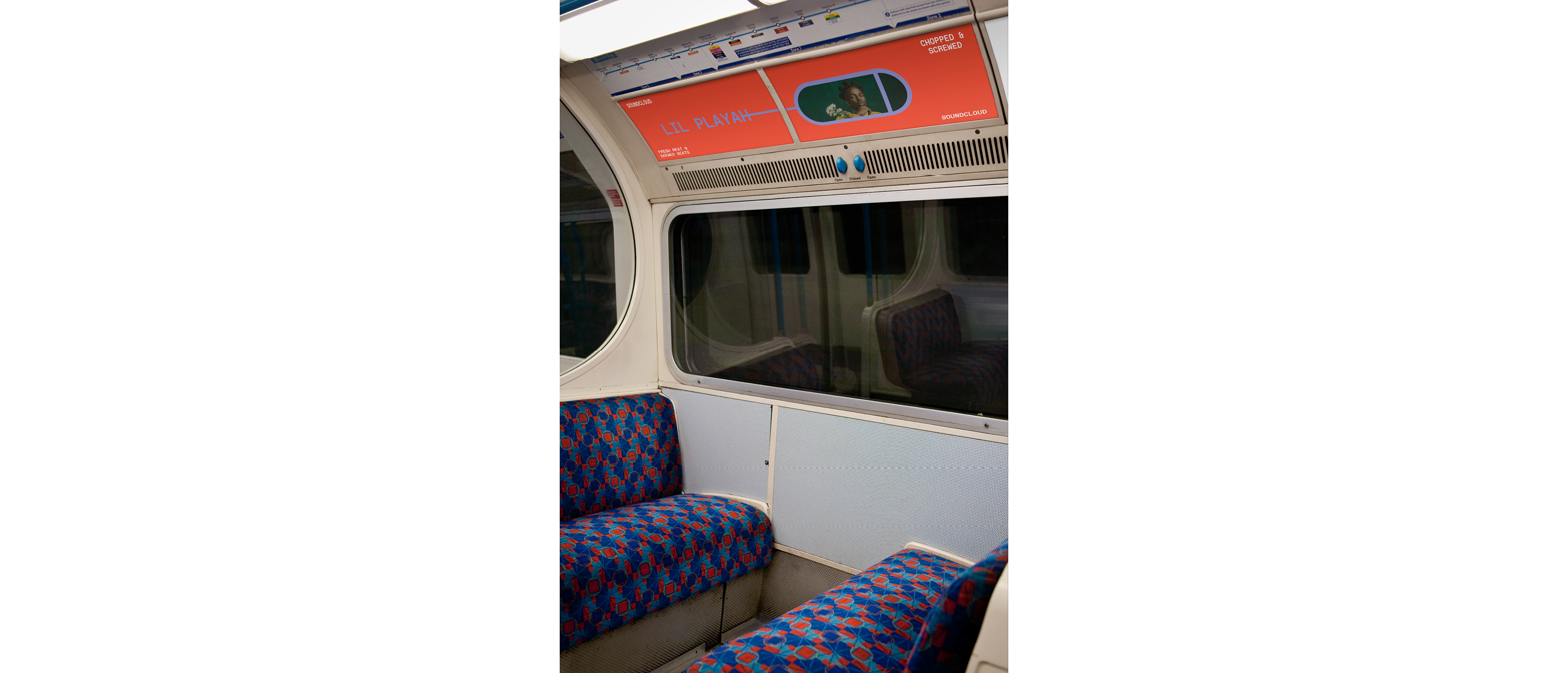
MAGAZINE LAUNCH PARTY:
Giving new and upcoming creators their 15 minutes in the spotlight is a big part of the new rebranding and in order to do that I proposed an annual magazine and concert series. The Hypothetical publication, Chopped & Screwed, could highlight the top 9 artists of the moment and be offered alongside a launch party where they would perform. Artists who usually play for no more than a room full of their friends will get the chance to perform in front of thousands.